Opéra de Reims
OR(gold) for everyone!
In 2023, the city of Reims entrusted the management of the Opéra to the "Frivolités Parisiennes" company. It's a first: never before has a lyric theatre been run by a collective. It's a bold choice, and one that increases their enthusiasm for imagining an opera for everyone.
The ambition of the new programme is to offer spectators quality musical performances, a place where all citizens - rich, poor, young, old, Reims residents, visitors, amateurs, neophytes, the curious - can come together to enjoy the Opéra's artistic offerings, a theatre that is wide open to the city, a box of surprises where you can enjoy new works as well as the repertoire, a place where you can come as a family to share, to be together, to pool your emotions.
Graphéine helped the Opéra to define a new brand positioning, create a new visual identity and produce communications for the season.

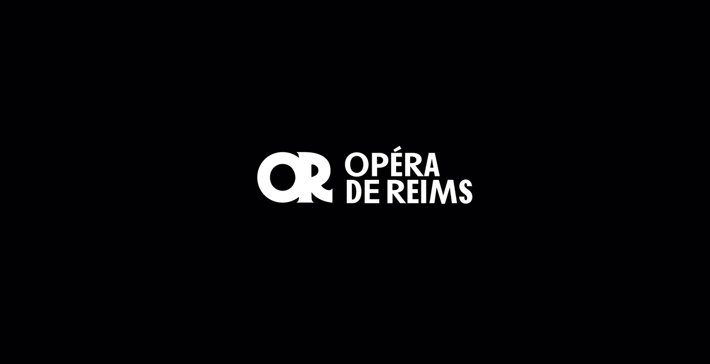
01. Logotype
The logo is a monogram "OR" made up of the initials of the words "Opéra de Reims". It is also an evocation of the word "Or" (Gold in French) symbolically referring to the gilding of the Opera, which will then be deliberately diverted to evoke the opposite idea of "GOLD for all" defining the promise of an opera accessible and shared with all Reims residents.
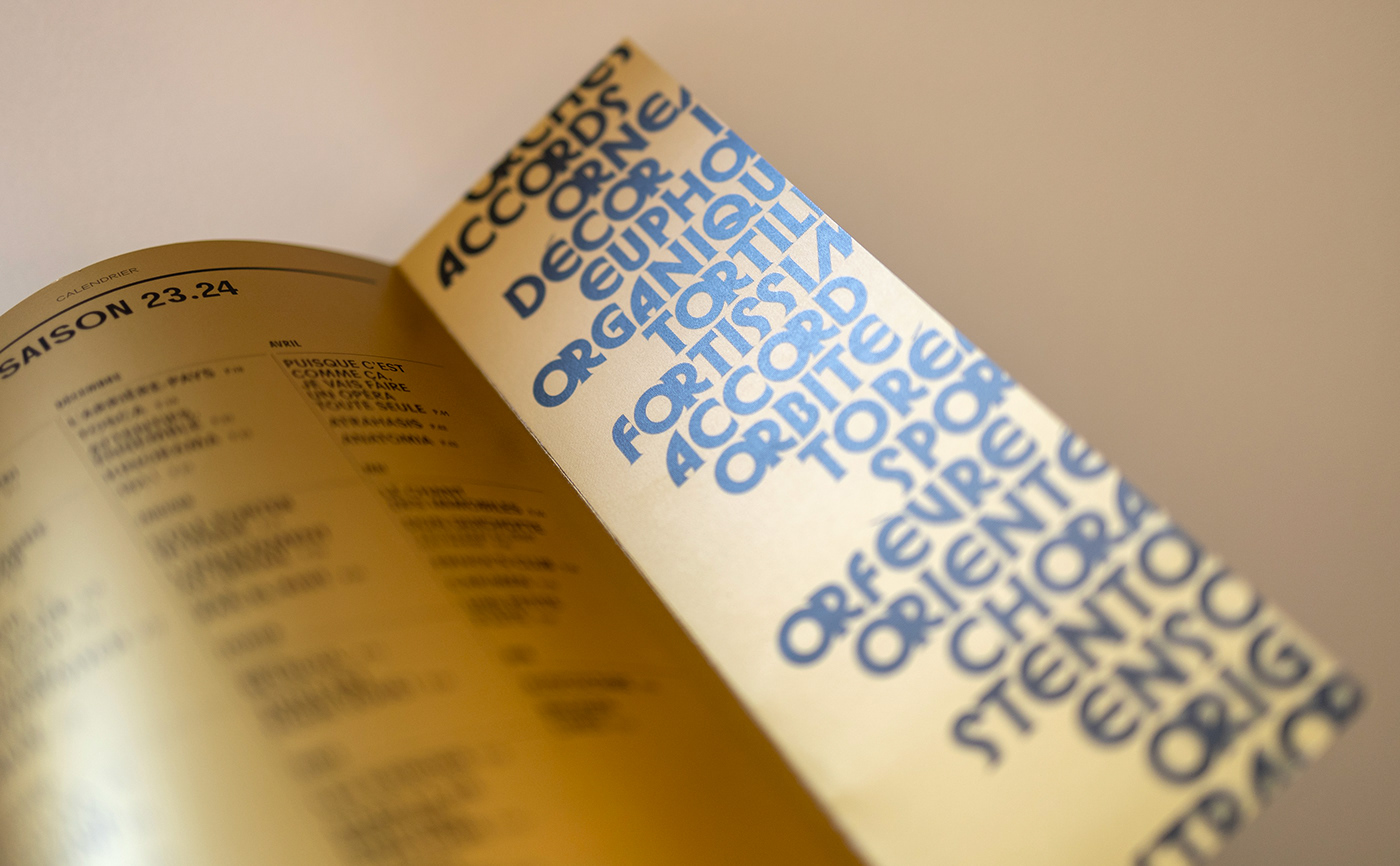
The monogram is a ligature based on the typeface Herbus. The title is composed using two distinct weights of Agipo. These two typefaces define the typographic palette of the Opéra de Reims' visual identity.


A logotype in the form of an animated character/mascot was created to embody the Opera's policy for young audiences.
02. Colors
The colour palette is extensive, offering multiple possibilities for matching. The secondary colours are bright and vibrant, contrasting with the institutional gold.


03. Headings
Titles are composed using 3 distinct weights (bold, bold italic and bold condensed) to give rhythm and character to the institution.

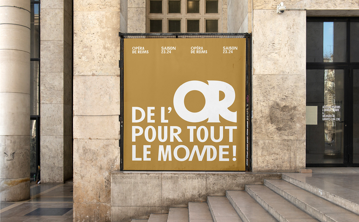
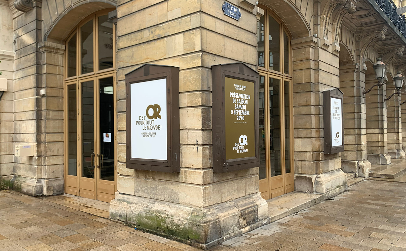
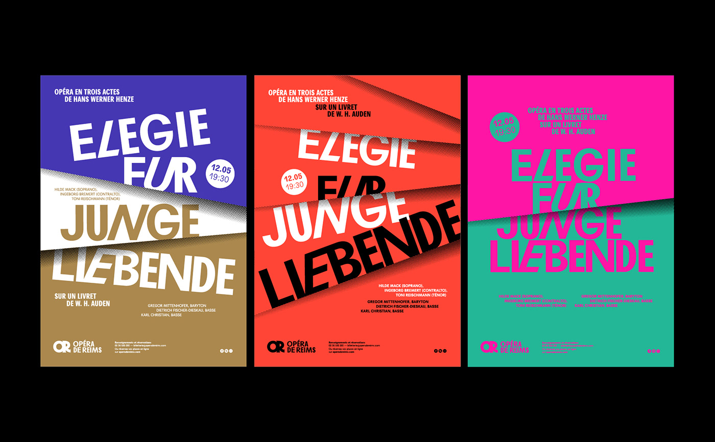
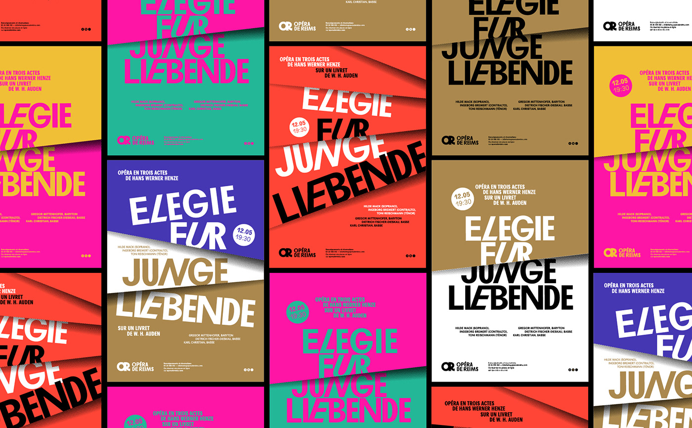
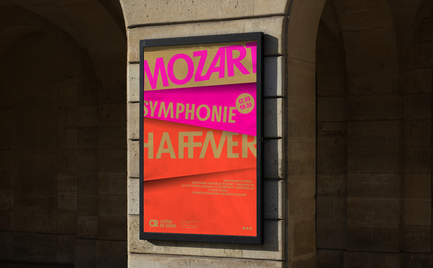
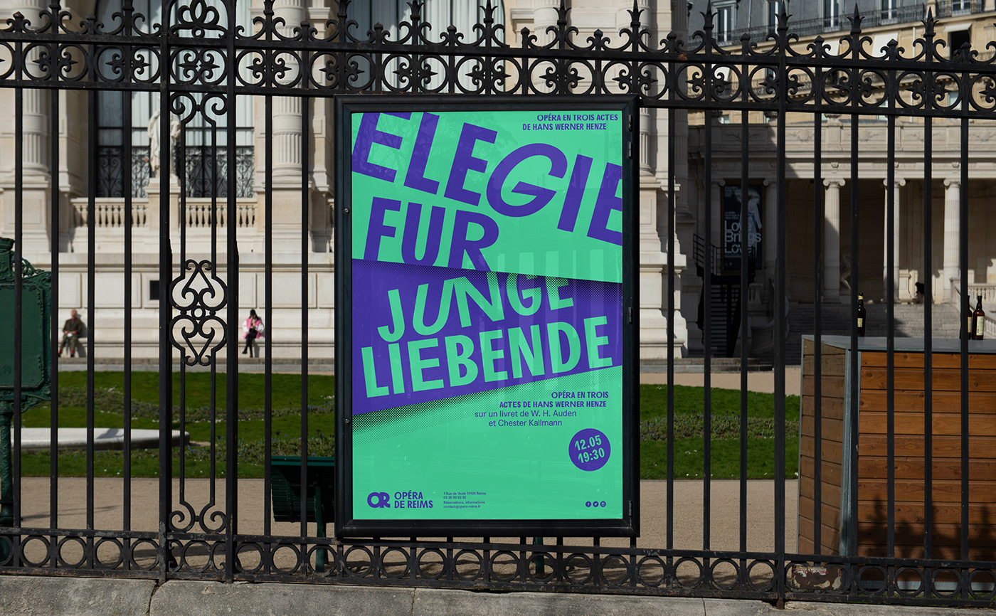
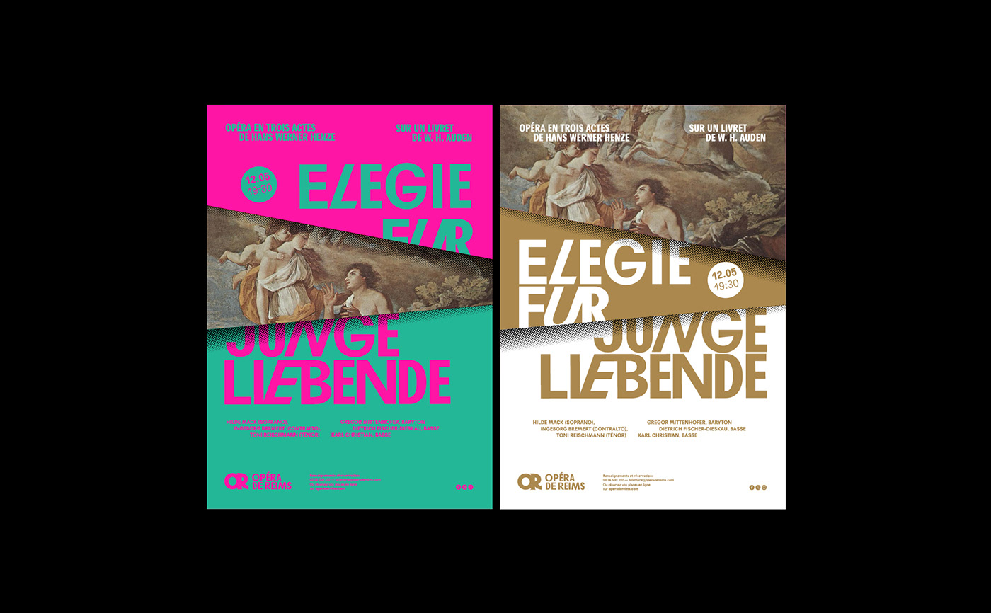
04. Composition of posters
The posters and visuals are composed using a system of staggered and superimposed flaps. By combining the possibilities in terms of colours with those offered by this page layout system, a coherent and constantly renewed whole is proposed.


05. Motion design
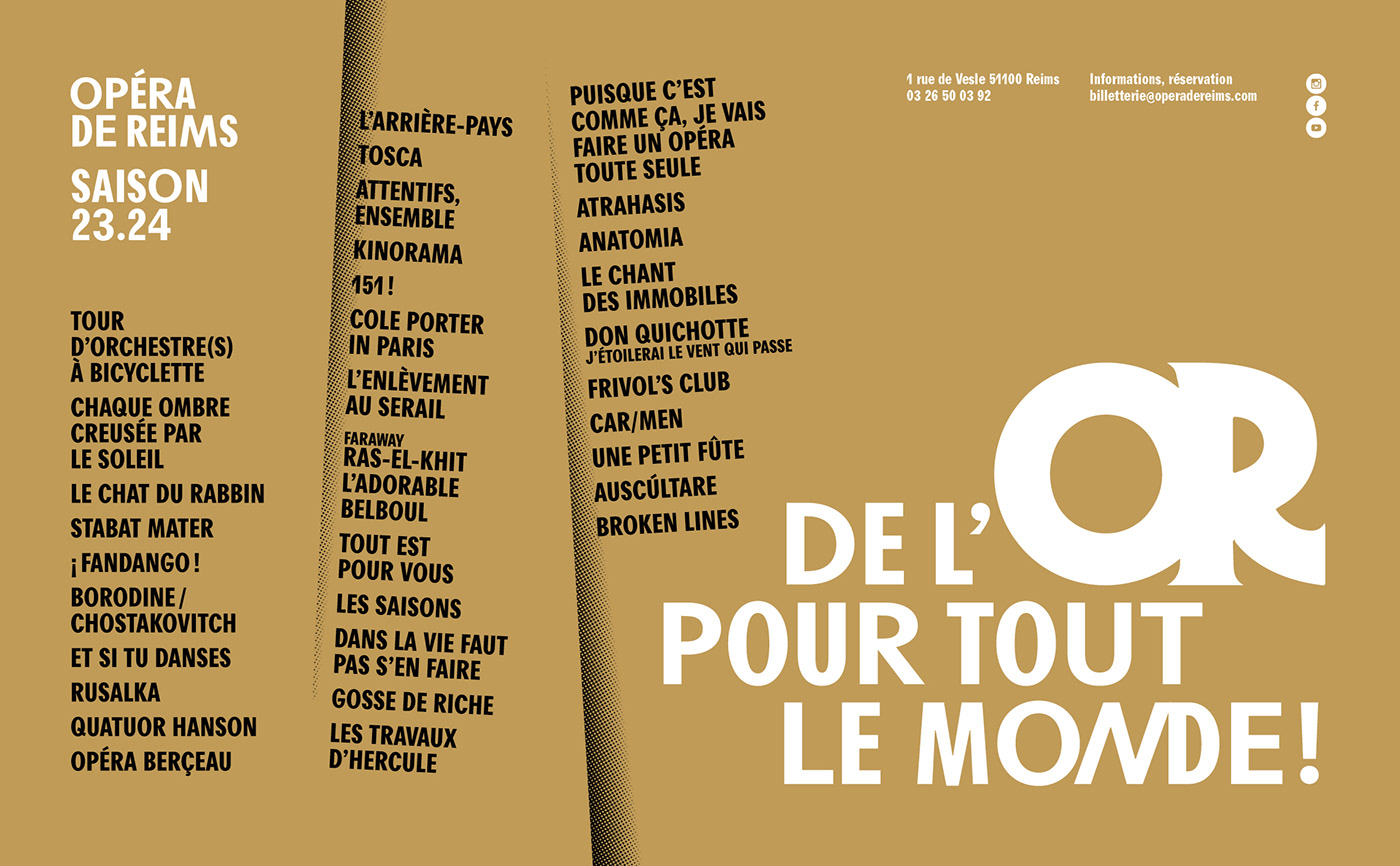
05. Season brochure

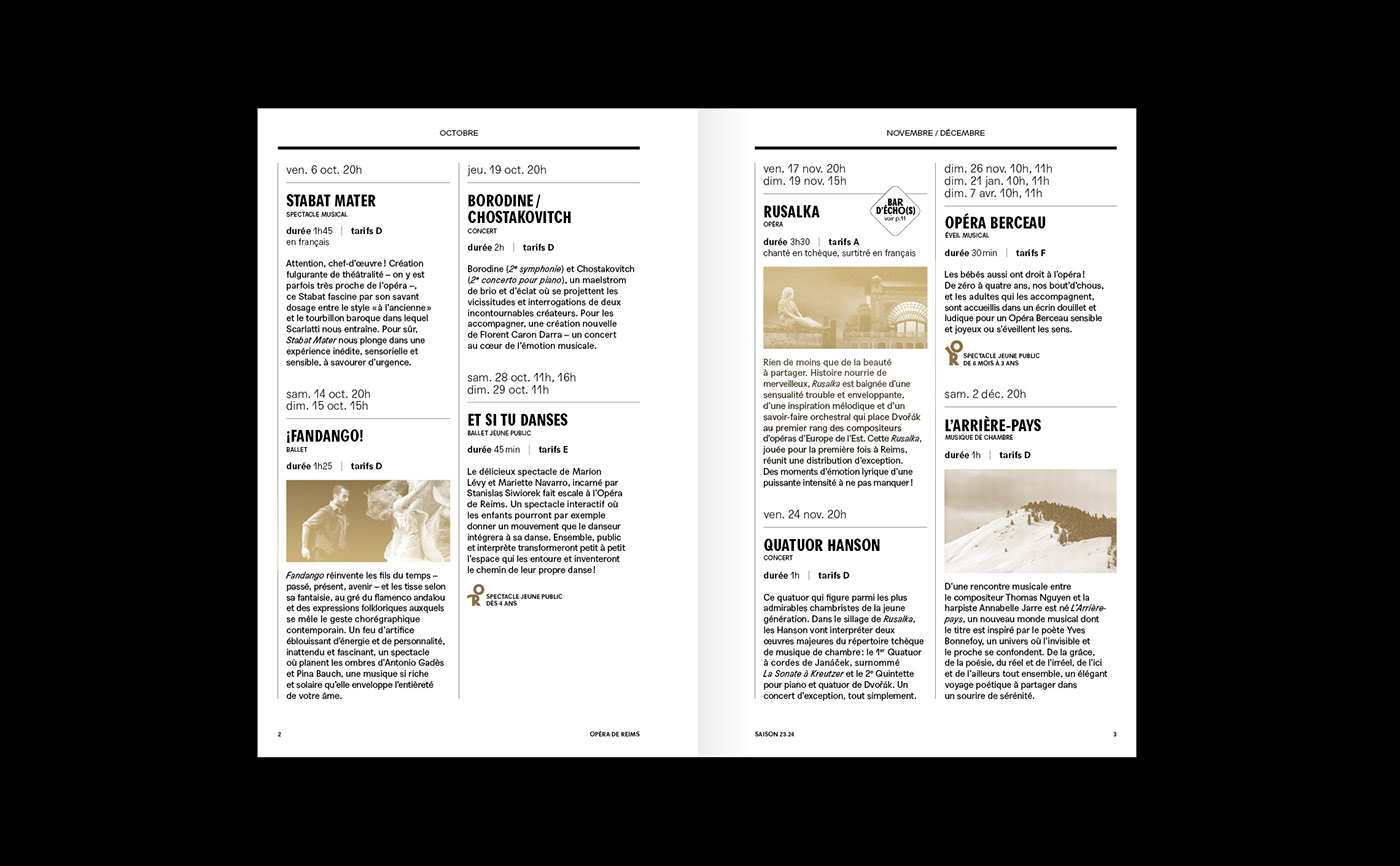


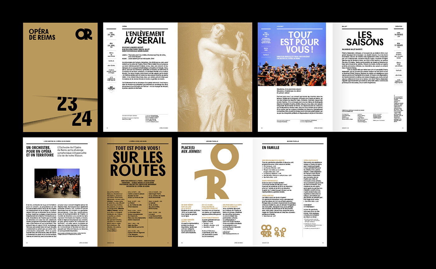
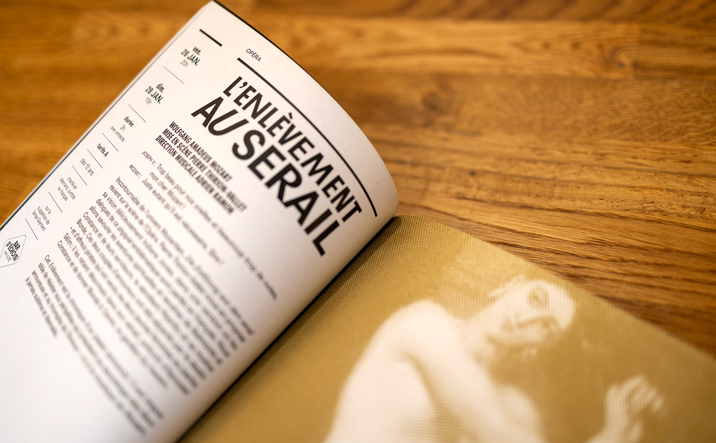


07. Season 23.24
For the new management's first season, we are proposing a unifying message that underlines the new visual identity while defining the Opéra de Reims' artistic and social project.